Navigational patterns are crucial in application design because they guide users through the experience in a way that feels natural, intuitive, and efficient. A strong navigation system helps users understand where they are, where they can go next, and how to get there without confusion or frustration. This is especially important in logistics or enterprise tools where users rely on fast, accurate access to complex features and data.
Well-structured navigation should accomplish the following:
-
Reduce cognitive load by presenting clear, consistent pathways
-
Improve user engagement and satisfaction by helping people accomplish tasks quickly
-
Increase usability across devices through responsive components such as side nav, top bars, and menus
-
Boost accessibility by making the app easier to use for everyone, including people with disabilities
Our navigation system incorporates the following components which serve as the foundation for a seamless user experience.
Side Navigation Bar
The side nav offers a persistent, easily accessible anchor point for the primary sections of the application. It should give users a clear understanding of where they are and what’s available at a glance. When used consistently across pages, it reinforces a mental model that helps reduce cognitive load.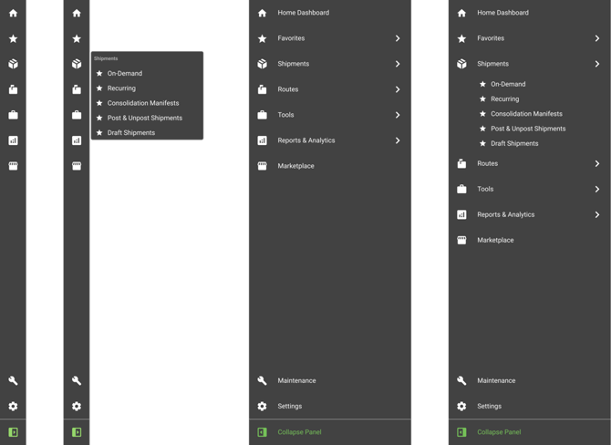
Side navigation shown collapsed and expanded in dark mode
Top Bar
The top bar keeps essential items accessible without cluttering the main workspace. Items in the top bar include profile settings, notifications, search, and quick actions.
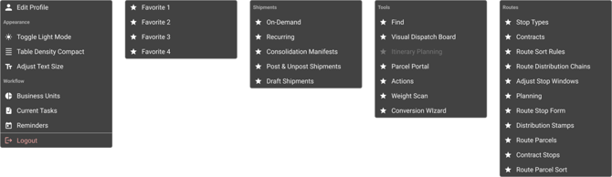
Menus
Menus help manage complexity. Whether dropdowns or context menus, they reveal options only when needed, minimizing visual clutter while still offering quick access to secondary features or settings.
Tabs
Tabs allow users to switch between related content or workflows within a single view.

Modals
Modals deliver focused experiences for critical tasks or confirmations such as editing an order or confirming a cancellation. Modals are intentionally designed to isolate specific actions that require user resolution before returning to the core interface.
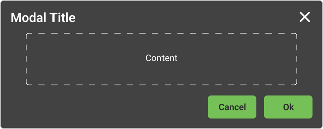
Basic modals consist of three main sections: the header, body, and footer.
Header - Includes the title which can be a short description based on the use case. The title should reflect the interaction that triggered it.
Body - Can have any type of content. This may be text, text inputs, dropdowns or other items.
Footer - Contains navigational and action buttons. Action buttons such as Save, Cancel, Delete, or Ok are on the right. Where applicable, an affirmative action should always be to the right of a negative action.
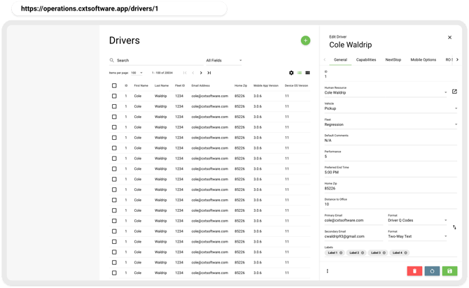
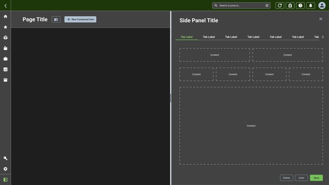
Side Panels
Side panels function as flexible workspaces for detailed information or editing without leaving the current page.
Conclusion
When combined with a unified design language i.e. consistent spacing, typography, and behavior, these patterns reduce friction, foster predictability, and empower users to navigate complex logistics operations with confidence and speed.
OLD PAGE FOR REFERENCE
Main Nav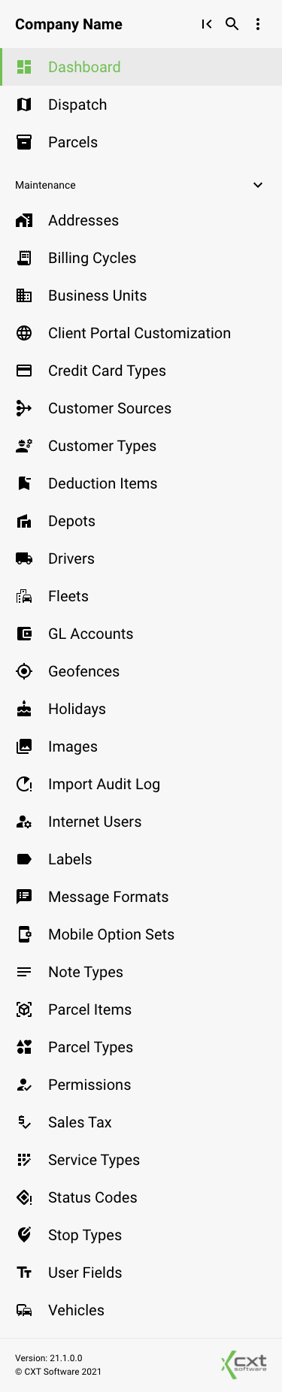
Listed below are all of the main navigation titles as well as links to their respective Google Material icons.
Top-level
Dashboard - Material Symbols and Icons - Google Fonts
Dispatch - Material Symbols and Icons - Google Fonts
Parcels - Material Symbols and Icons - Google Fonts
Maintenance
Addresses - Material Symbols and Icons - Google Fonts
Billing Cycles - Material Symbols and Icons - Google Fonts
Business Units - Material Symbols and Icons - Google Fonts
Client Portal Customization - Material Symbols and Icons - Google Fonts
Credit Card Types - Material Symbols and Icons - Google Fonts
Customer Sources - Material Symbols and Icons - Google Fonts
Customer Types - Material Symbols and Icons - Google Fonts
Deduction Items - Material Symbols and Icons - Google Fonts
Depots - Material Symbols and Icons - Google Fonts
Drivers - Material Symbols and Icons - Google Fonts
Fleets - Material Symbols and Icons - Google Fonts
GL Accounts - Material Symbols and Icons - Google Fonts
Geofences - Material Symbols and Icons - Google Fonts
Holidays - Material Symbols and Icons - Google Fonts
Images - Material Symbols and Icons - Google Fonts
Import Audit Log - Material Symbols and Icons - Google Fonts
Internet Users - Material Symbols and Icons - Google Fonts
Labels - Material Symbols and Icons - Google Fonts
Message Formats - Material Symbols and Icons - Google Fonts
Mobile Option Sets - Material Symbols and Icons - Google Fonts
Note Types - Material Symbols and Icons - Google Fonts
Parcel Items - Material Symbols and Icons - Google Fonts
Parcel Types - Material Symbols and Icons - Google Fonts
Permissions - Material Symbols and Icons - Google Fonts
Sales Tax - Material Symbols and Icons - Google Fonts
Service Types - Material Symbols and Icons - Google Fonts
Status Codes - Material Symbols and Icons - Google Fonts
Stop Types - Material Symbols and Icons - Google Fonts
User Fields - Material Symbols and Icons - Google Fonts
Vehicles - Material Symbols and Icons - Google Fonts
Routing
When routing around the application, it is best to actually use the browser routing to help manage state. This can help users better navigate around using the built-in browser navigation options such as keyboard arrows, the back and forward arrow, opening views in a new tab, bookmarking, sharing links, etc.
For example, the link to edit a driver should navigate to the path: `/drivers/${driverId}`