Input fields, including text fields and text areas, allow users to enter and edit text into the UI. Read only fields are not editable.
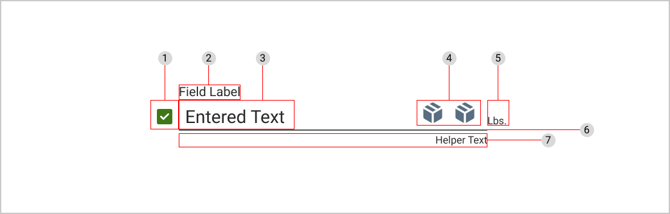
Anatomy
-
Leading icon / checkbox (optional)
-
Field label text
-
Input text
-
Trailing icons (optional)
-
Suffix text (optional)
-
Input line
-
Helper text (optional)
Field Label Text
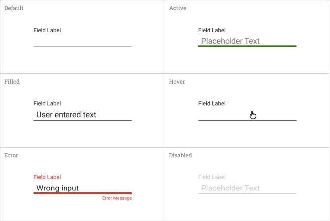
Field label text is used to inform the user what information is being requested for the text field or text area. Every text field should have a label.
Field label text should be aligned with the input line and always visible. It should be placed at the top left of each input field.
Required Fields
Required fields will be signified with an asterisk (*) next to the field label text. In addition, field label text in required fields will be displayed in an orange “highlighter” style. Once the user has entered an input into a required field, the orange highlight should disappear.

Input Text
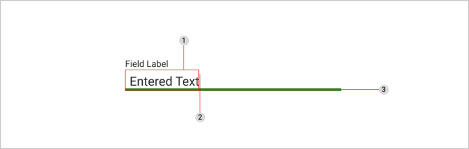
Input text is the text that the user enters into the text field. Input text should be clearly visible and legible. The cursor indicates the current location of text input in the field.
-
Input text
-
Cursor
-
Input line displayed in active state
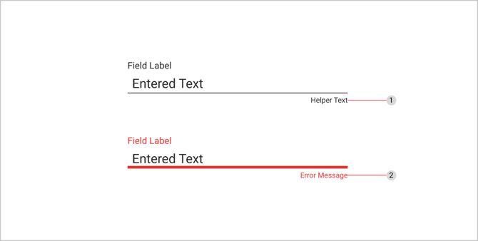
Helper Text & Error Messages
-
Helper text
-
Error message
Helper text provides users with additional guidance about the input field, and what is being asked. It should be a concise message and only take up a single line. It can span the length of the input line and remain persistently visible.
Display an error message if the user input is not acceptable. Error messaging can replace helper text where applicable and should provide clear instructions to the user about what needs to be fixed.
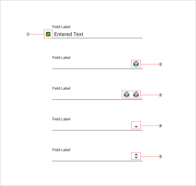
Icons
Including icons as part of input fields is optional. Throughout our application, there may be instances that require the use of multiple icons in one input field. Typically icons will allow users additional actions or controls related to the input.
-
Leading icon / checkbox - used to indicate an active state
-
Single trailing icon
-
Double trailing icons
-
Dropdown icon - indicates the text field has a nested selection component
-
Numeric up/down control - used for numeric inputs where users can adjust the value by clicking the arrows, using up and down arrow keys, or typing in the field directly
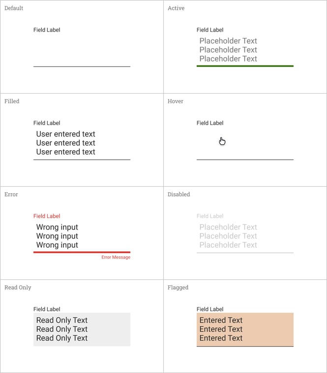
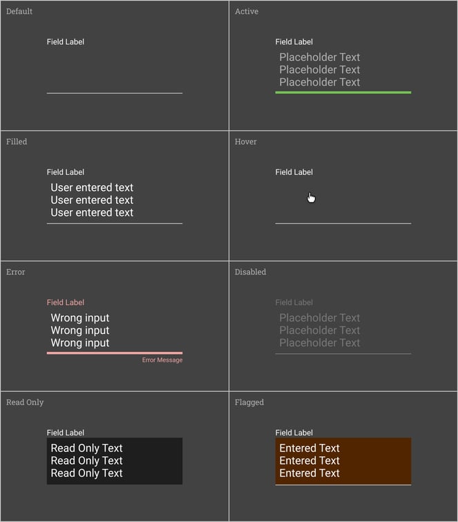
States
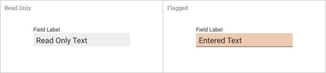
Read Only & Flagged Fields
Read only fields display pre-filled data that the user cannot edit. Flagged fields are less common but can be set by users via a separate control in the UI. Read only and flagged fields are styled differently in that they include a background fill behind the input text.
Text Areas
Text areas retain all of the same basic anatomy and color styling applied to text fields. The main difference is text areas have an increased variable height which allows room for multiple lines of text. Depending on the use case and amount of user input, text areas may feature also a vertical scroll.